
News
Color making according to Italian contemporary decorators
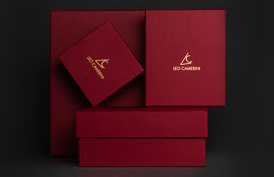
Coloring is the soul of Leo Camerini style.
[ This interview is available in Italian and English ]
Coloring is the soul of Leo Camerini style. The process starts from the research of new inspirations, followed by various trials. Exploring and experimenting drive us to new appealing color combinations.
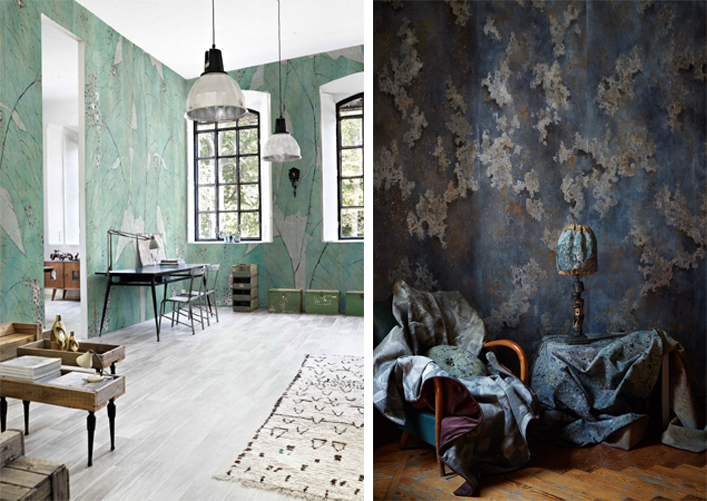
Today, we are visiting Fabscarte, a design atelier in Milan which handcrafts colorful paper decorations for sophisticated and distinctive living spaces.
The common point between Leo Camerini and these decorators is the attention dedicated to color making. We both aim to create distinguishing products for our markets.
With the help of Luigi Scarabelli, one of the founders, we learn the philosophy behind Fabscarte artworks and we discover some hidden aspects of contemporary handmade coloring techniques.
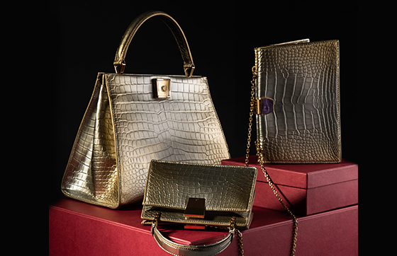
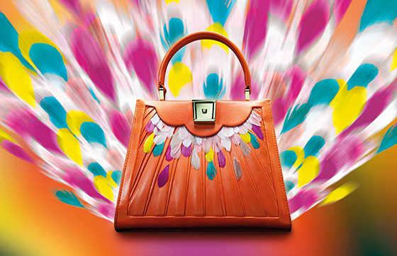
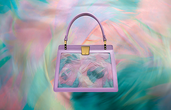
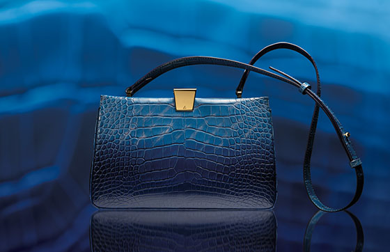
LC: When I think of a new color, first of all, I consider which handbag model I will paint in it. Moreover, each model may have different colorations, according to the owner’s future uses or tastes. Do you follow more an emotive approach, focusing on the psychology underneath the color or more a practical approach, starting from the environment you are going to decorate?
LS: If the decorative painting, whether it will be on paper or on a wall, is going to be a prototype, used for internal research, we let emotions guide the preparation process. So, in this case, we can talk more about an artistic figure. From this latter, we will work on the final product for the market. It is important to precise, that we do not put functional constraints during the creative phase. After we are convinced of the first prototype, we picture it from a rational point of view and we give it functionality.
If we start a project directly from the client’s space, therefore this setting becomes the focal point.
Just to mention an obvious example, if a person wants to go horse riding, the tailor will not make her an evening dress, but specific made-to-measure riding clothes.
Back to us, our artworks are designed to be perfectly suited to the space to be decorated.
LC: Our eyes see one or numerous tones, depending on the intensity of the light. Brightness is crucial for the comfort of a living space. Which techniques do you use to graduate the light of your colors and how do you balance the differences among them?
LS: Without any doubts light is a crucial element. We create artworks for clients around the World. Each part of the World has specific light gradations. Therefore, after we have done the first prototypes, we need to go and observe the actual scene and control if the shades of the color we created match with the original light of that space.
Regarding to the gradation of light, we consider Nature an absolute mentor. Nothing else like Nature is able to balance and harmonize colors, alone and together.
It is important to know the color theory and practice because if you know the different variables, then it is possible to rightly juxtapose different tones. In our decorative paintings, colors always create volumes; they are coated, according to the tradition of the old times. Coating techniques allow to enrich the color either with depth or chiaroscuro effects. The color is represented just like in Nature. If we take a look at the leaves on a branch, we realize they have different green nuances: the lower appear with darker shades; the upper with brighter tones. They all depend on the light that reflects on them. Finally, they all are in harmony because they are a concept of Nature’s pure genius.
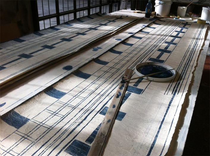
LC: Not only you craft your own colors, but you also work on the material. At Fabscarte, you mostly use paper. Do you consider this latter as a simple base to colors or it is also a great contributor to achieve the uniqueness of the final product?
According to the type of paper, which principles must you follow in the preparation of colors?
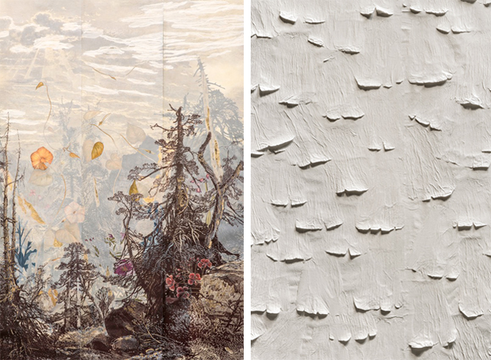
LS: Paper is more than a simple tool, indeed. It takes part to the whole crafting process. As an example, we have invented particular ruffled paper tissues. Their structure helps to give a tridimensional shape to the artwork. Painters know well that trompe-l’œil effects are given by the paint, but they are accentuated by the material. For this reason, we use materials such as our ruffled paper tissues. Obviously, we need to test each type of paper, to see how they absorb the paint. The beauty of this job is the variety of results you may have: either you start with a precise idea, that find practical proof either you let intuition guide your work. You need to be present with your inner self. It is vital to be able to look at yourself; let yourself go and observe what happens around you. At that point you do not risk to make any mistake. From one error, perhaps a better idea may win over the initial one.
You just need to be humble when you pursue your craft, which you have learnt in the years. Let’s consider a pianist, for example. He knows so much about her art, that her hands spontaneously play. She needs to trust her hands and the music consequently comes out. It is the same experience with painting. When you find your inner self, you can achieve aesthetic beauty and you feel the amazing sensation of living that moment. I do not know how to explain this concept. If a person finds her inner self, she reflects it in her artwork.
LC: At the beginning of 20th century, French couturier Paul Poiret achieved great success by presenting collections rich of bright and contrasting colors. It was a clear statement against the pastel tones, very popular in the fashion and design of the Belle Époque period.
Today, we are in a world where innovation is almost exclusively related to technological progress. High level handcraft talents are the less and less. How do you renovate your color offer?
LS: Nowadays if you want to renovate your color palette you must follow the principle of harmony. You can create new combinations, but they always have to be harmonic.
Harmony can be seen in different ways. It can be experimental, but it has always to be the product of an initial idea. There is no room for fortuity.
When someone, after years of experience, knows by heart classic colorations, she can try something “more contemporary”. She has the right feeling in her gesture and her mind. For instance, a musician, who has studied classical music for a long time, is related to classical melodies. She can leave that scheme and change style, but just because she has her inner musical harmony, already nurtured for many years.
If you do not have an inner harmony, then you are stuck. You can try to imitate something from the outside, but you will just mislead those who are unable to observe and feel. Yes, colors can be observed and perceived. When speaking of coloring, sight can be tricky, but perception never is.
In practice, you can experiment new color techniques. Nowadays, there is an infinitive choice, but you will always need your inner harmony. If you find it, your craft will impress. Otherwise, you will remain a simple imitator.
LC: It is said that 17th century painter Rembrandt, created his unique deep shadows, by instinctively scrapping and mixing all colors left on his palette. Without experimentation color research and study cannot be fulfilled.
How do you think experimental approaches have evolved from past generations to the future ones? Do they depend more on tradition or on instinct?
LS: Rembrandt story is an interesting example.
Evidently, he possessed a palette on which colors were already creating a sort of harmony. Painters know what I am talking about. If you intensively mix all colors on the palette, you create a deep dark shadow, which contains all nuances. You have ten colors on your palette; you scrap and mix them all together; you create a shadow which has all the ten color nuances.
Speaking of experimentation, the only effective approach is to confront yourself and your beliefs. Always try to challenge yourself. Learning all possible coloring techniques is not enough. You need to be self-conscious and have your mind deeply involved in your craft. This constant endeavor helps to keep your mind active. It can revitalize a day or a longer period. On one side you have an expertise gained from your own roots and traditions; on the other side you are open to new challenges. This is true experimentation. If you can succeed in this, your path will be smooth. If you cannot, do not worry. It is just a matter of trying again.
LC: The real quality of Made in Italy resides in different creative forms, deep-rooted in our country. When we think of Italian talent we immediately associate it to manual ability. What are the differences between Italian handcraftsmanship and the traditions from other parts of the World?
LS: Unfortunately, current times are not favorable for the survival of Made in Italy. Today, in Europe reigns a vast and intricated bureaucratic system that suffocates creative talents. It is an unpleasant statement, but it is a true one. Creative minds will be the more and more requested and researched because they will be the less and less common.
Only a balanced and smooth social contest is a fertile field for creativity. As a matter of fact, during the Renaissance, everything made was genius and excellent. It was a clear and ordered environment.
The current social framework threatens creativity. Nevertheless, it is not just a general issue, but it is also a problem caused by the individual.
I also have another theory. We are lucky to live in our territory, since Italy has a continental climate, which is instable. It constantly changes. By contrast, a stable weather highly influences people’s common needs and perception of change. In Italy we live all four seasons, therefore we always need to adapt to a different weather. It may seem a strange idea, but try to think about it for a moment.
Our climate is not the only variable that allows us Italian to develop a creative genius. Our innate desire and consciousness to avoid any kind of rule is another important characteristic. Of course, we feel that rules help to gain stability and security, but at the same time, somehow, we have the perception that they take away our life purpose to improvise something new, every moment. We love this kind of experience. Without this we cannot exist. An Italian person excels in crafting an artistic creation just from improvising and experimenting.
LC: As representatives of the Italian contemporary design, renowned Worldwide, if Milan would be a paper surface, with which colors would you painted it? And which technique would you use?
LS: I would choose grey for Milan. It is a cliché, but it is true: grey fits perfectly for this city. Nevertheless, I wish to dispel the myth. Grey is a very hard color to make, because it is truly a “grey area” in the vast color palette we know. It is a very interesting color. The most beautiful grey is the one that absorbs all the three primary colors. If you think about grey, you instantly think of a black and white mix. That is not fully correct. Black and white together create an azure-like type of grey. A well-made grey contains yellow, red and blue. You can make variants by simply gradating these three colors.
Grey easily matches to many other tones, simply because it contains the three primaries in the right proportions. So, my Milan is grey. Which technique would I use to paint my city? At the moment I am not quite sure. I will think about it for the next time!
It has been very interesting to listen to your thoughts and learn about Fabscarte. Thank you very much for your time.
[ Pictures courtesy of Fabscarte Milano ]